In today’s digital world, where digital marketing dominates, printed marketing materials like brochures may seem like a relic from the past. However, they remain a powerful and versatile tool for businesses and organizations to convey their message, promote their products or services, and ultimately drive conversions. To achieve this, it’s crucial to create brochures that not only look visually appealing but also effectively communicate your brand and offerings. In this comprehensive guide, we’ll explore a range of tips and strategies for designing brochures that not only capture attention but also convert readers into customers.
1. Define Your Purpose and Audience

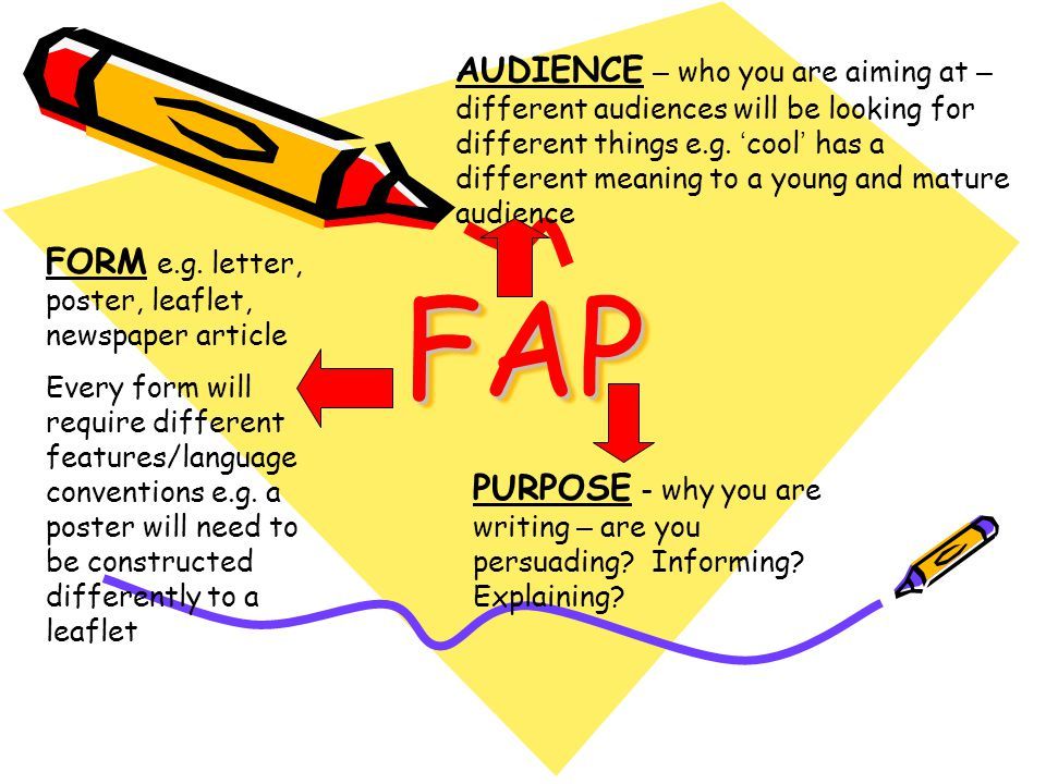
Before diving into the design process, it’s essential to have a clear understanding of your brochure’s purpose and identify your target audience. Your purpose could range from promoting a specific product or service to providing essential information about your organization or event. Understanding your goals and audience will inform your design choices and content strategy.
2. Craft a Compelling Headline
Your brochure’s headline is the first thing readers will see, so it needs to be both attention-grabbing and informative. Use clear, concise language and consider incorporating a powerful, attention-grabbing phrase that speaks directly to your audience’s needs or desires. Your headline should encapsulate the essence of what your brochure offers.
For instance, if you’re designing a travel brochure, a compelling headline might be, “Escape to Paradise: Your Dream Vacation Awaits! Discover Exotic Destinations and Unforgettable Adventures.”
3. Focus on Visual Hierarchy
Effective brochure design relies on establishing a strong visual hierarchy to guide the reader’s eye through the content. Use size, color, and typography to emphasize key elements such as headings, subheadings, and calls to action. Make sure the most crucial information is easily accessible and stands out. Consider adopting the F-pattern, which is a reading pattern commonly used in web design, where readers typically start at the top left, move across to the right, down to the bottom left, and then across to the bottom right.
4. Limit the Use of Fonts
While variety can make your brochure visually interesting, it’s best to limit the number of fonts you use to two or three complementary ones. Choose fonts that align with your brand’s identity and are legible in both print and digital formats. Using different fonts for headings and body text can create a clear and visually appealing distinction.
5. Use High-Quality Imagery
High-quality images significantly enhance the visual appeal of your brochure. Invest in professional photography or source high-resolution stock photos that align with your brand and message. Avoid using pixelated or low-quality images that can detract from the overall impression. Your choice of imagery should be relevant to your content and resonate with your target audience.
For example, if you’re designing a brochure for a restaurant, high-quality images of the dishes you offer can make the reader’s mouth water and create a strong desire to dine at your establishment.
6. Keep the Copy Concise and Engaging
Brochures are not the place for lengthy paragraphs or verbose descriptions. Instead, use concise and engaging copy that gets straight to the point. Highlight the most critical benefits, features, and information. Utilize bulleted lists and short paragraphs to present information clearly and concisely. Every word should add value and contribute to the overall message.
7. Include Testimonials and Social Proof
To build trust and credibility, consider incorporating customer testimonials, reviews, or endorsements within your brochure. Genuine endorsements from satisfied customers can influence potential buyers and increase conversion rates. Feature real customer quotes along with their names and photos to make the testimonials relatable and trustworthy.
For example, a real estate brochure might include a testimonial like this: “Working with ABC Realty was a breeze. They found us our dream home within our budget.” – John and Jane Smith.
8. Design for Scanning
Understanding that readers often skim through brochures, design your content with scanning in mind. Use subheadings, bullet points, and visual cues to help readers quickly identify key information. Break up text with ample white space and strategically placed visuals. Keep paragraphs short and focused, and use descriptive subheadings to guide readers to relevant sections.
9. Create a Strong Call to Action
Every effective brochure should include a clear and compelling call to action (CTA). Whether it’s encouraging readers to visit your website, contact your sales team, or make a purchase, the CTA should be prominently displayed and easy to follow. Use action-oriented language that conveys a sense of urgency or benefit.
For instance, a CTA for a fitness center might say, “Start Your Fitness Journey Today – Join Now! Claim Your Free Trial.”
10. Choose the Right Paper and Finish
The choice of paper stock and finish can significantly impact the overall look and feel of your brochure. The tactile experience of holding a well-printed brochure can leave a lasting impression on the reader. Consider factors like paper weight, finish (matte or glossy), and any specialty coatings.
For example, if you’re designing a brochure for a luxury boutique, opt for a high-quality, heavyweight paper with a matte finish that exudes elegance and sophistication. Conversely, a brochure for a children’s toy store might benefit from a glossy finish that makes the colors pop and adds an element of playfulness.
11. Pay Attention to Color Psychology
Colors evoke emotions and convey meaning, making color selection a critical aspect of your brochure design. Consider the psychological impact of colors in your brochure design:
- Blue: Conveys trust, reliability, and calmness.
- Red: Represents energy, passion, and excitement.
- Green: Symbolizes growth, health, and nature.
- Yellow: Evokes positivity, happiness, and optimism.
- Black: Signifies sophistication, elegance, and luxury.
Choose colors that align with your brand and message, and be consistent with your color choices throughout the brochure.
12. Test and Iterate
Before finalizing your brochure design, gather feedback from colleagues, friends, or focus groups. Testing your brochure with a small audience can help you identify any issues and make improvements. Be open to making revisions based on feedback. Ensure that your design resonates with your target audience and effectively communicates your message.
13. Print and Distribute Strategically
Once your brochure design is perfected, choose a reputable printer to ensure high-quality production. Consider your distribution strategy carefully. Are you handing out brochures at events, mailing them, or displaying them in-store? Tailor your distribution method to reach your target audience effectively. For instance, if you’re promoting a local event, distribute brochures at community centers, local businesses, and through direct mail to nearby residents.
14. Track and Analyze Results
To measure the effectiveness of your brochure, track key metrics such as website visits, lead inquiries, or sales that result from its distribution. Use this data to refine your brochure design and content for future campaigns. Identify which elements of your brochure are most effective in driving conversions and adjust your strategy accordingly.
15. Stay Consistent with Branding
Your brochure should be an extension of your brand identity. Ensure that it adheres to your brand’s colors, fonts, and style guidelines to maintain a consistent and recognizable brand image. Consistency across all marketing materials helps reinforce brand recognition and trust with your audience.
Designing effective brochures that convert requires
a thoughtful and strategic approach. By defining your goals, understanding your audience, and applying design principles, you can create brochures that engage, inform, and motivate readers to take action. Remember that a successful brochure is not only visually appealing but also effectively communicates your brand’s value proposition and resonates with your target audience.
With the right design and distribution strategy, your brochure can be a powerful tool for driving conversions and achieving your marketing objectives. Invest in the design process, and your brochures will become a valuable asset in your marketing toolkit, leaving a lasting impression on your audience and driving meaningful results. When thoughtfully designed, a brochure can convey your brand’s message with impact, convert readers into loyal customers, and contribute to the growth and success of your business or organization.
Additional Tips for Brochure Design

To further enhance your brochure design and make it even more effective, consider the following additional tips:
16. Tell a Compelling Story
Incorporate storytelling elements into your brochure to engage readers emotionally. Share success stories, customer journeys, or the history of your brand. Stories create a connection and leave a lasting impression.
17. Highlight Benefits, Not Just Features
While it’s essential to showcase the features of your product or service, don’t forget to emphasize the benefits. Explain how your offering solves problems, fulfills needs, or enhances the lives of your customers.
18. Use Visual Data
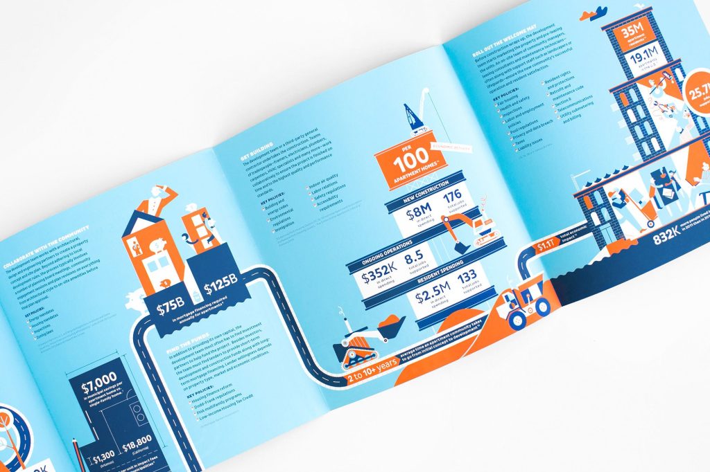
If applicable, incorporate graphs, charts, or infographics to visualize data or statistics that support your claims. Visual data can make complex information more accessible and memorable.
19. Personalize When Possible
If you have customer data, consider personalizing your brochures with the recipient’s name or relevant personalized content. Personalization can significantly increase engagement.
20. Emphasize Trust Signals
Include trust signals such as industry certifications, awards, or partnerships to build credibility and reassure readers that they are making the right choice by choosing your product or service.
Designing Brochures That Truly Convert
Designing a brochure that not only looks great but also converts readers into customers is both an art and a science. It requires a deep understanding of your audience, effective visual communication, and a persuasive narrative. By incorporating the tips and strategies outlined in this comprehensive guide, you’ll be well on your way to creating brochures that leave a lasting impact and drive conversions for your business or organization.
Invest the time and effort into crafting brochures that resonate with your audience, and you’ll reap the rewards of increased brand recognition, customer engagement, and ultimately, business growth. Your brochure can be a powerful tool in your marketing arsenal, serving as a tangible representation of your brand’s values and offerings in the hands of potential customers.


Average Rating